Silence on St. Goldleaf Lane: A Book Cover Design
In this project I created a Book Cover for a Historical mystery story plot I wrote, combining strong typography and Photoshop manipulation.
What?
Personal project
Category
Book cover design
Year:
2020

The task
The task was to design a captivating and visually striking book cover for Silence on St. Goldleaf Lane, a historical mystery novel set in 1900s London. The cover needed to reflect the Mystery/Thriller genre while keeping a sense of intrigue. The focus on the story's central character is a female P.I, which was an unconventional role for the time period. The cover had to interest potential readers while also somewhat maintaining authenticity to the historical setting and genre trends.

What I did / Challenges
To tackle the challenges of this project, I began by researching the visual style of detective novels set in the early 1900s, paying particular attention to typography, colour palettes, and overall composition.
I sourced historical imagery that reflected the atmosphere of 1900s London and used Photoshop to manipulate these visuals into a seamless design.
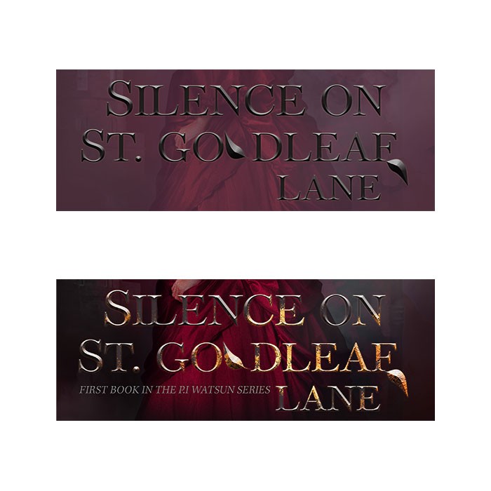
I wanted to avoid depicting the protagonist’s face, which allowed readers to imagine her for themselves, while still giving subtle cues to her role as a Private investigator (thus the choice in an image where the character looked as though they were on a move).
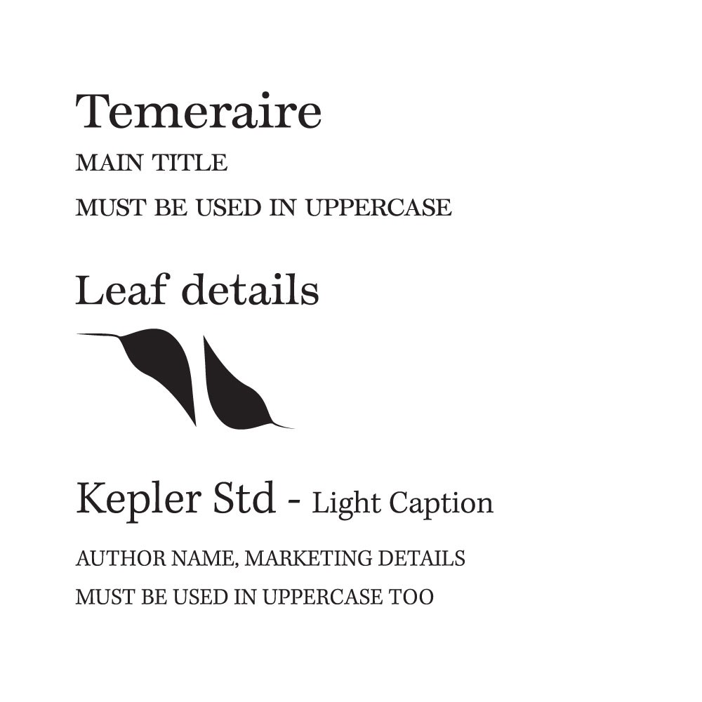
I carefully chose typography that captured the period's style and complemented the moody, suspenseful tone of the book. Through use of dark red tones and imagery of mist, I was able to create a more sinister and mysterious mood, while ensuring the design remained true to the genre’s conventions. I had the idea of a gold flake look come from the name 'Goldleaf'.
The choice to have a strong female lead dressed up was to address that it was still hugely stigmatised for women to not wear dresses.
Outcome
I revealed this cover to several avid thriller book lovers. The cover received positive feedback for its mysterious tone, especially noting the choice to hide the female's face and to keep her in historically accurate attire for this time. They appreciated its historical authenticity and the way it captured the suspenseful nature of the book. Also, attention on the typography was noted as a nice touch to the 'Goldleaf'

Key takeaways
Research into genre conventions and historical design trends helped ensure that the cover would resonate with readers and feel authentic to the period.
Typography played a crucial role in setting the tone and mood of the cover, making it essential to choose fonts that reflected the time period while remaining legible. And being creative in ways to elevate typography
Leaving space for the reader’s imagination, particularly by avoiding the depiction of the main character’s face.
Blending historical elements with modern design approaches helped create a cover that felt both timeless and contemporary.